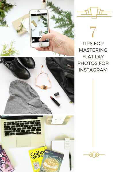
7 tips for mastering flat lays for Instagram January 03 2017
70% OF INSTAGRAM USERS HAVE SEARCHED FOR A BRAND ON INSTAGRAM
It is more important then ever for entrepreneurs to have our brand presence on Instagram be on point! Your voice, your brand, your colours, what makes your company special and your company's values needs to be spoken through each of the images and captions of your Instagram feed.
MORE USERS THEN EVER BEFORE ARE SPENDING MORE TIME ON MOBILE DEVICES THEN DESKTOPS
So making beautiful flat lays and creating awesome images for our social media accounts is a top priority. As a jewellery designer from Canada, I'm constantly doing flat lays for my social media accounts. Since it's all about capturing the perfect image of my one-of-a-kind jewellery pieces, I've spent a TON of time practising and mastering the flat. I hope these tips will help you capture photos of your best flat lays too.
HERE'S 7 TIPS FOR MASTERING INSTAGRAM FLAT LAYS
1. WHITE BRISTLE BOARD
White bristol board will become your best friend. Unless you use a different colour for your Instagram feed other then white. Some people use dark images for their feed and they make it totally work for them (we go over the different feels and colour combos in the Instagram101 workshop). Usually light and bright photos are proven to get more likes on Instagram which in turn will help you pop up higher in the algorithm so more potential customers will see your images.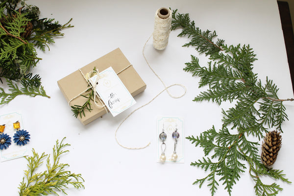
2. NATURAL LIGHT
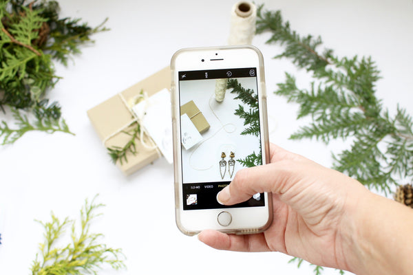
Natural light is what it's all about. If you can get that natural light going even taking iphone photos look like professional SLR photos. For the first year of growing my account my ENTIRE page was iphone photos. You don't need a fancy camera to grow your brand and presence you just need some natural light. 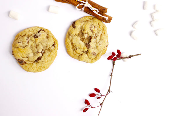
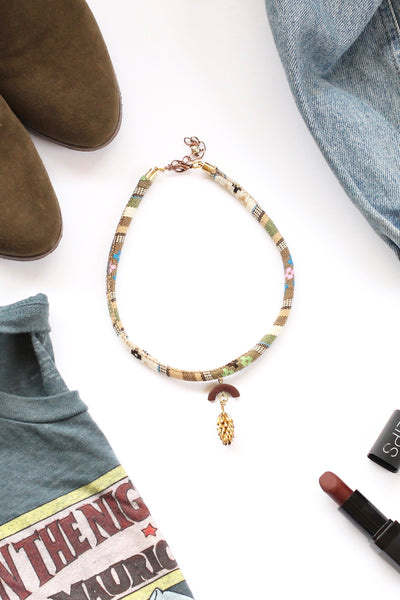
3. PROPS
Props are key to any Instagramers account. People love seeing consistency, which is why colours for your brand is so important (we also go over having a branding board in my Instagram 101 workshop). I always suggest to start collecting a prop box. (More on the prop box in the workshop)
4.LAYERS AND DEPTH
Layers and depth make an image come to life. When you're creating a flat lay it's important to ad layers and depth. This makes the image feel real and often people on Instagram like close up shots with depth to them. Try crumpling a t-shirt instead of laying it completely flat to give your photo some height depth, or stack a bunch of photos to cast shadows to again create some depth to your images. 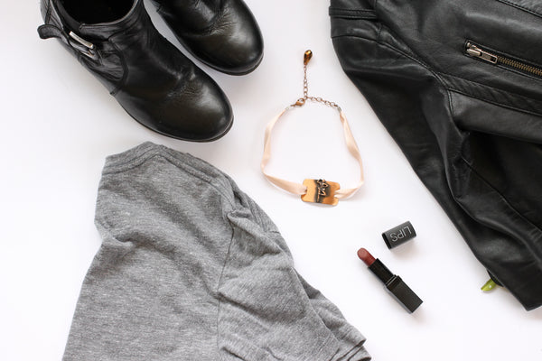
5. EYES GO LEFT TO RIGHT TELL A STORY
Eyes go left to right so choose the object you want to focus on and centre your props that go with your story. If you're showing a photo of your desk, lay the objects on your bristol board or on your desk space that would go with the story you're trying to tell. If you're showing people your agenda asking them to book appointments with you try styling with a canister of cute pencils (depth and height) with your computer and a coffee mug or a pair of glasses. Make the most important object (the planner), what you're talking about in your caption the first thing they focus on, then as they head left to right with their eyes, the next most important thing.... but sometimes it's okay just to make things look pretty. 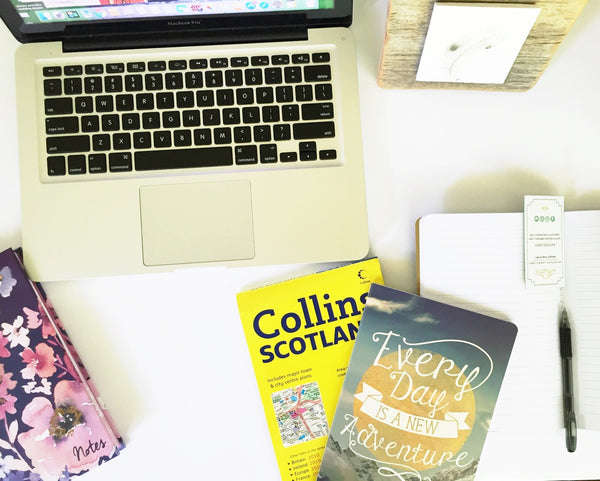
6. THREE OBJECTS
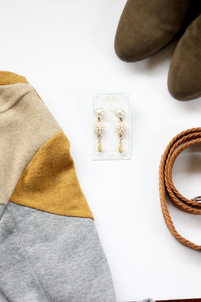
Three objects seems to be the magic number for me. I'm not saying this is the case every time, but for some reason if I have more then three things in my photo it's too busy my eyes don't know where to go. Start with your main focus, then slowly add in your props and objects until you find just the right amount.
7. DON’T BE AFRAID TO CROP
Don't be afraid to crop your photo... aka leave things out of the image. You don't have to give EVERYTHING away. Your followers get the gist of it, this also helps point their eyes onto what the focus is in your image by not allowing them to get lost on every single object in your shot.
8. BONUS TIP
TAKE DIRECTLY ABOVE the flat lay you've created. Flat lays look best when the photo is taken directly above.
WE ONLY HAVE AN 8 SECONDS ATTENTION SPAN
In my generation we have an 8 second attention span. My nephew's generation (he's 15) only has a 6 second attention span. That means we only have 8 seconds to get them to click follow or engage them to click to your website from your Instagram account. That is NOT very long. That's a lot of pressure on those first few images and the over all look and feel of your Instagram feed. It's important that your captions, your first 9 photos, your branding colours, your hashtags, your feed, your story telling, your community are all working for you and that you know how to market effectively on Instagram.
78% OF CONSUMERS MAKE PURCHASING DECISIONS THAT ARE INFLUENCED BY A BRANDS SOCIAL MEDIA.
If you want to learn more about my Instagram101 workshop where we go over growing your brand, making a beautiful feed, keeping your current customer engaged and attracting new customers, you can head over here -----> http://bit.ly/INSTAGRAM101hj I also give away all my tips and tricks on how I went from 500 followers to over 3500 followers in just over a year.
DOWNLOAD MY FREE GUIDE ON THE BIGGEST MISTAKES ENTREPRENEURS MAKE ON INSTAGRAM
To view more of our unique, handcrafted & one of a kind jewellery handmade in Toronto Canada click here. http://www.hattitudejewels.com/collections/all
